Joyuus
Start-up brand strategy and brand identity for a digital health innovator dedicated to supporting moms in postpartum.
The project
Joyuus, co-founded by Kristine Merz and Lisa Marceau, began its journey as a digital health startup with an innovative vision. Orange Square was pivotal as the lead Principal Investigator for Joyuus’ Small Business Innovation Research (SBIR) Phase One grant, guiding the early stages of development. The subsequent acquisition of the Phase Two grant marked Joyuus’ evolution into an independent entity.
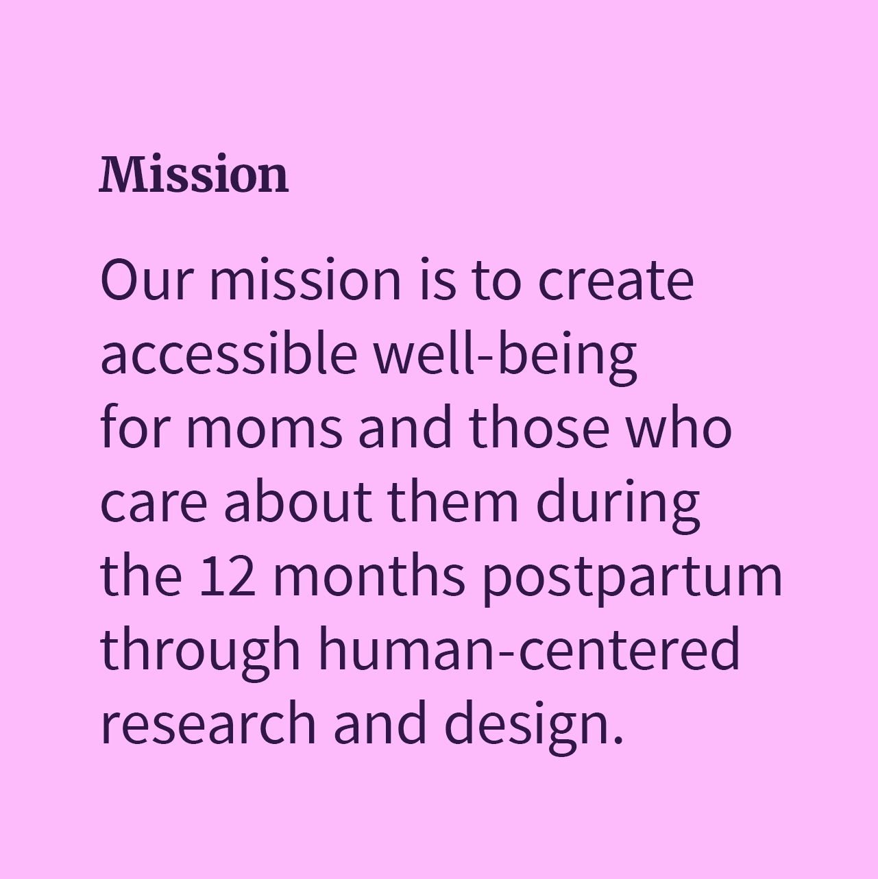
With a mission to transform postpartum care for mothers and caregivers in the crucial first year, Joyuus began defining its identity and strategy in a dynamic, evolving landscape. During this initial phase, the blending of strategic insights and creative input played a key role in forming the brand’s foundational identity.
Our work with Joyuus focused on enhancing this foundational strategy into a distinctive brand and visual identity. This involved a multi-step process of strategic and creative development deeply rooted in Joyuus’ mission and values. This comprehensive approach shaped each aspect of the brand identity, including the logo, color palette, and typography. The result was a visually engaging identity that aligned with Joyuus’ mission to support mothers, effectively blending functionality with aesthetic appeal.
The challenge
How do you carve out a distinctive identity for a startup in the highly competitive women’s health industry?
This was our challenge. In a sector where memorable and concise branding is essential, our first task was finding a brand name for Joyuus that was not only impactful and trademarkable but also accompanied by an available .com domain. The struggle to secure a short, memorable domain name in an already saturated market was significant.
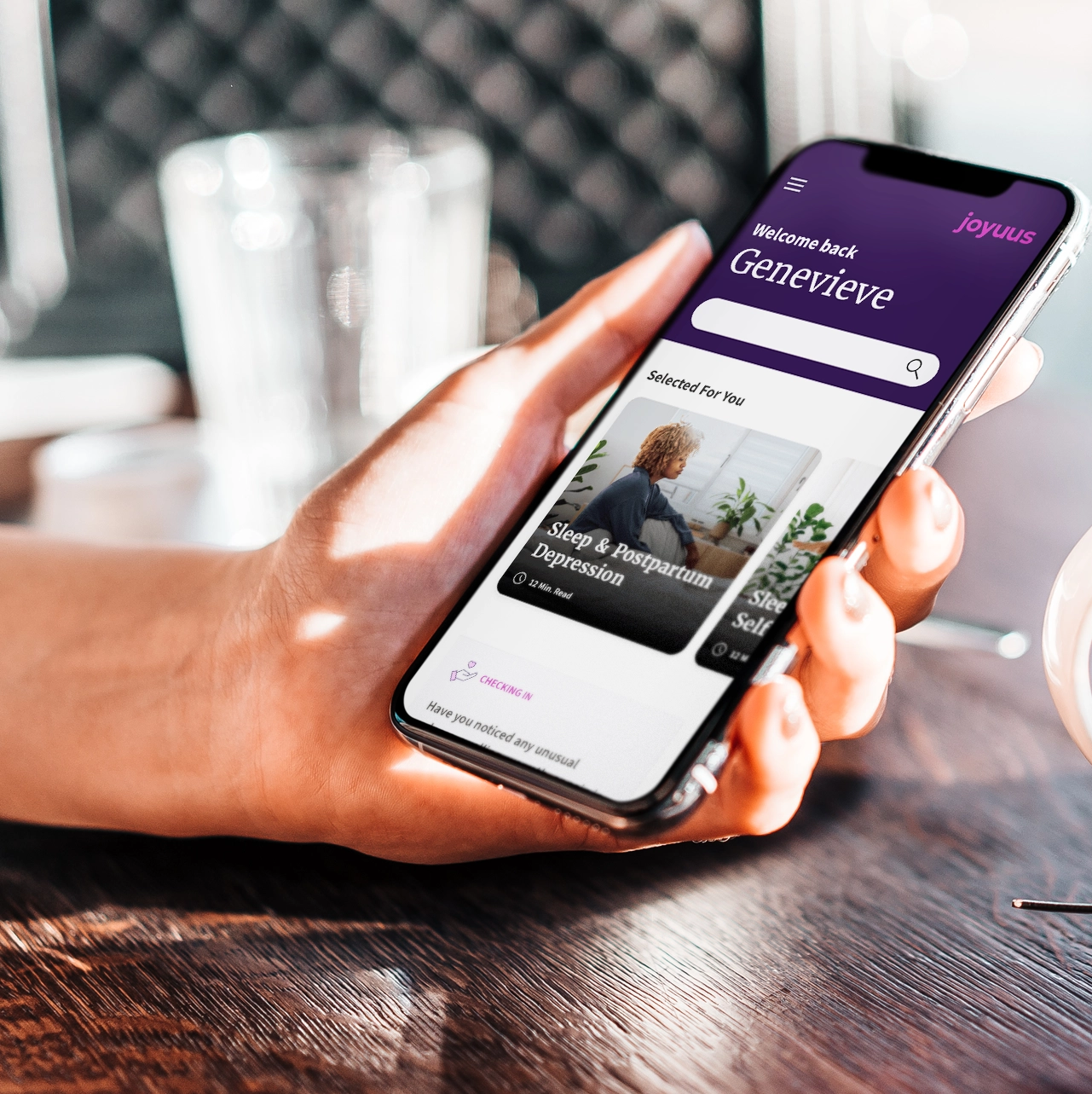
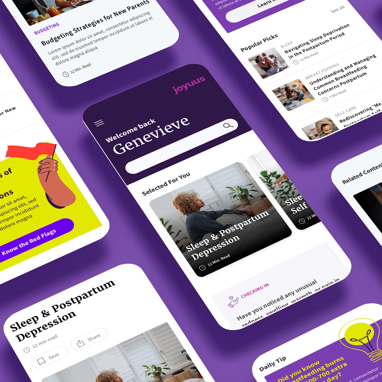
Beyond the name, the challenge extended to developing a visual identity that would stand out among competitors and harmoniously align with the women’s health community. This identity was pivotal to the marketing strategy and had to be seamlessly integrated into Joyuus’ primary offering—a web application focused on the 12 months postpartum. It needed to resonate deeply with the audience, reflect their values, and enhance user engagement, all while navigating the fine line between distinctiveness and compatibility within the industry’s landscape.
The strategy
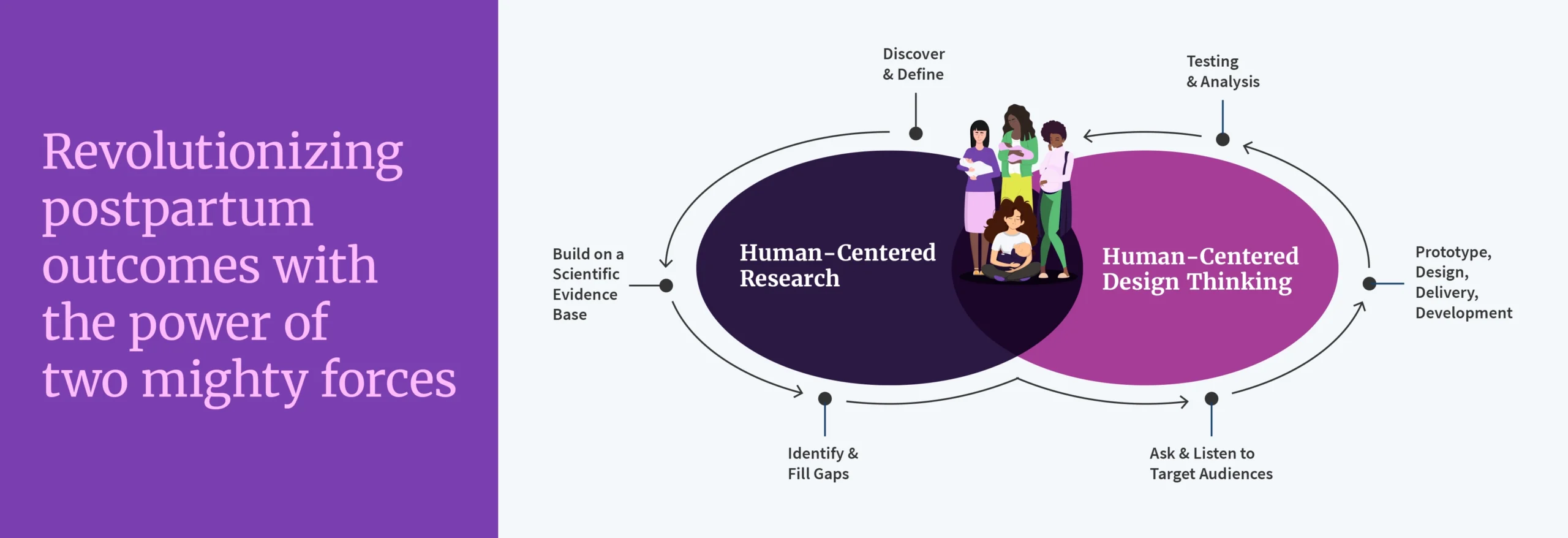
Developing Joyuus’ brand identity required a strategy as multifaceted as the challenges we faced. At the core of our approach was a human-centered design philosophy tailored to new mothers’ unique experiences and needs.
We dove deep into understanding new mothers’ unique needs and experiences, a crucial step to ensure the brand genuinely resonated with its primary audience
Our comprehensive strategy involved a blend of research, insight, and creativity, laying the groundwork for a brand identity that was both distinctive and reflective of Joyuus’ core values. This strategic foundation set the stage for the development of a robust visual identity, each element of which was a manifestation of our overarching vision.
Visual identity development
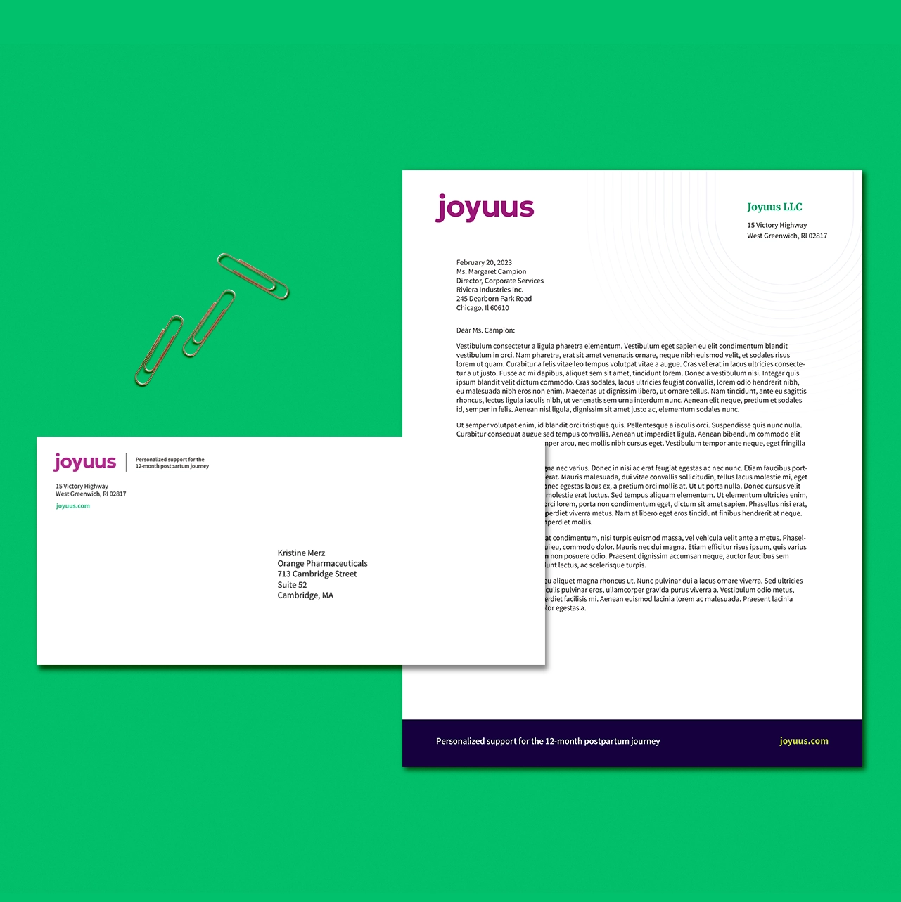
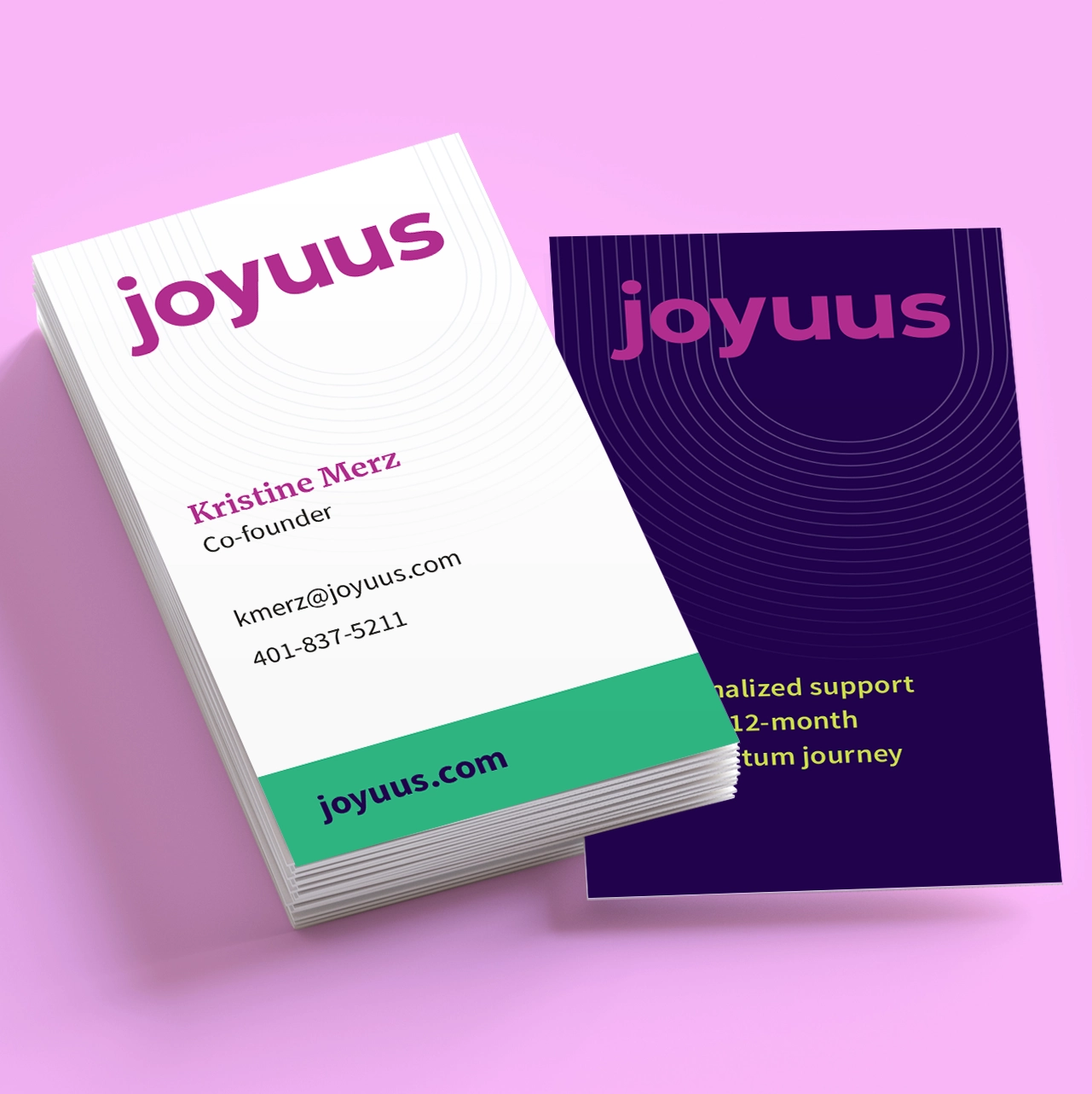
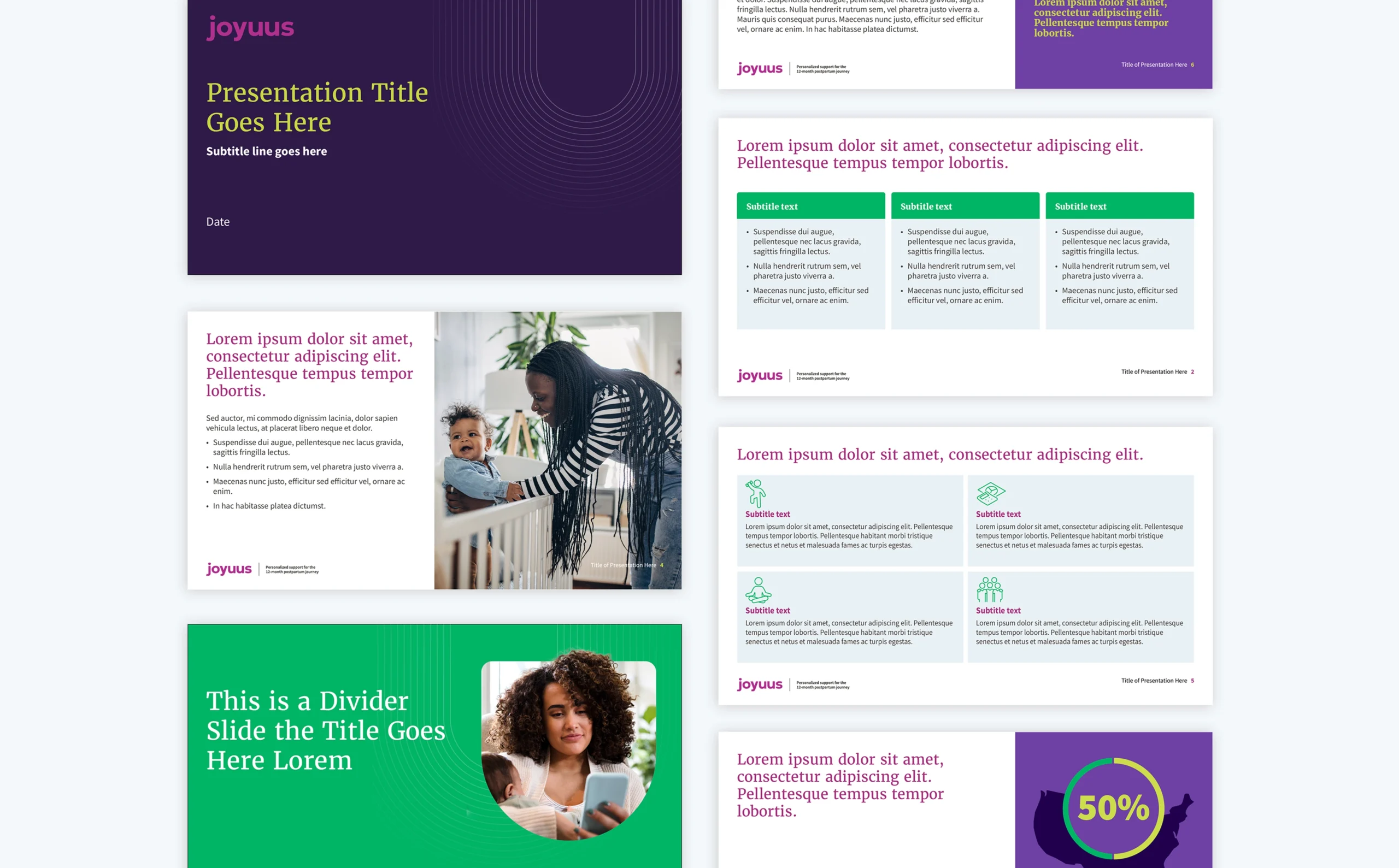
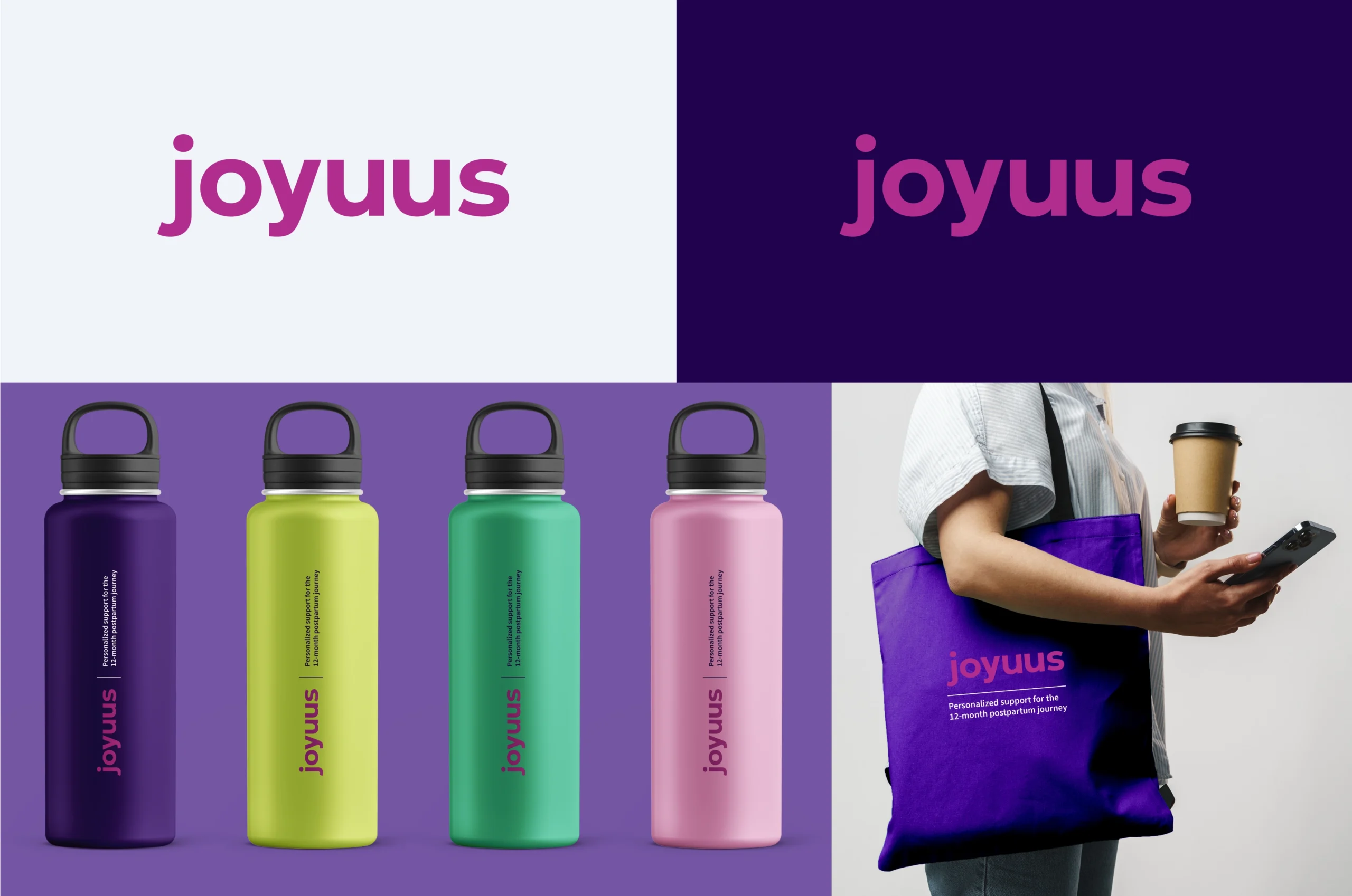
Logo
The Joyuus logo, designed for versatility and adaptability, meets the criteria for an impactful brand mark. It’s easily recognizable across various platforms, from digital spaces to print materials, ensuring consistency in brand presence.This design not only symbolizes Joyuus’ dedication to inclusivity but also stands out in the highly competitive women’s health sector, providing a clear, memorable identity amidst a sea of competitors.
Color palette
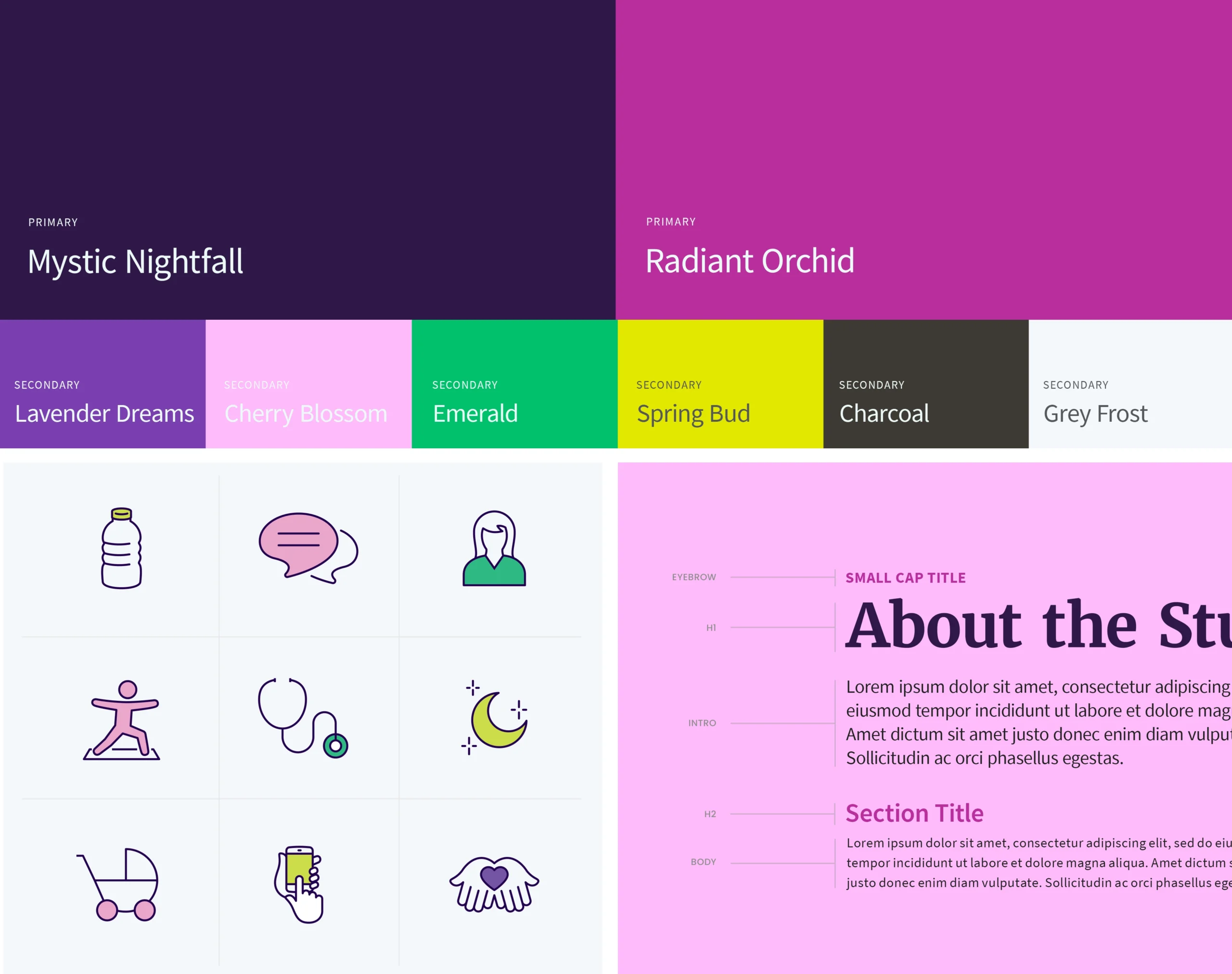
The Joyuus color palette stands out for its vibrant and diverse selection, moving beyond traditional gender norms to appeal to a broad audience. Its flexibility allows for a wide range of combinations that are vibrant and clear, aligning with ADA standards. The harmonious interplay of colors allows for dynamic use across various media, offering the brand a versatile and inclusive visual language. This strategy ensures Joyuus differentiates itself in the competitive landscape of women’s health, fully embracing its mission of inclusivity and support.
Typography
Joyuus’ type system focuses on readability and character. The chosen typefaces enhance digital engagement and align with Joyuus’ digital-first approach, ensuring content is accessible and engaging.
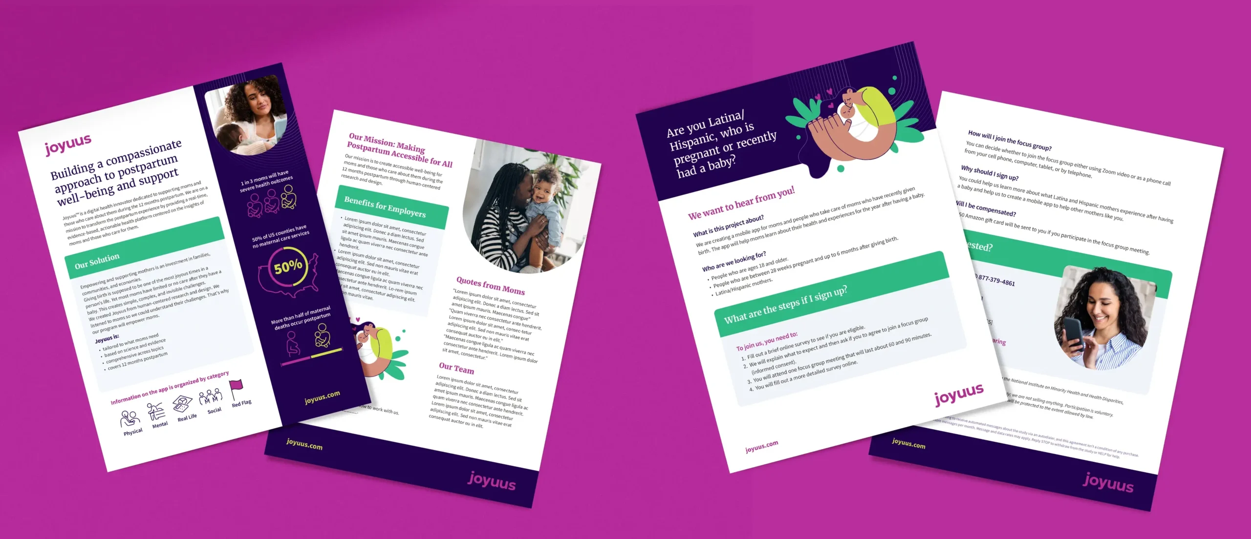
Icon system
These icons blend simplicity with functionality. Their sleek lines and rounded corners create an inviting look, while their adaptability to the brand’s color palette ensures a cohesive visual experience.

Supporting graphics
The ‘U’ shape in Joyuus’ brand identity serves as a distinctive visual device that spotlights motherhood in various contexts. It’s used creatively across brand communications, such as framing impactful photography that brings moments of motherhood to the forefront, ensuring the subject stands out with depth and focus. This consistent use of the ‘U’ shape as a design element supports the brand’s mother-centric narrative and adds a unique touch to the visual storytelling, making it recognizable and meaningful.
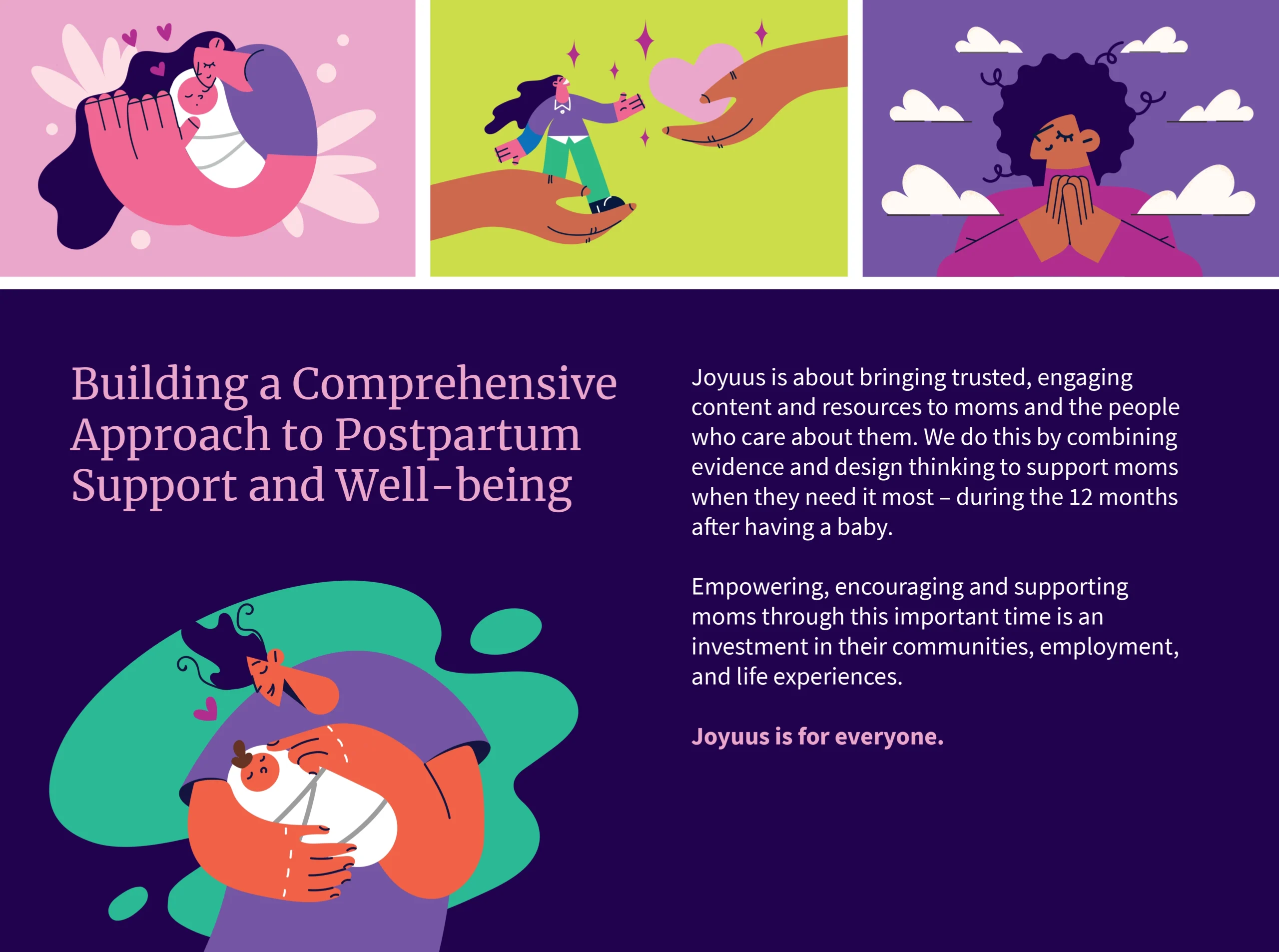
Illustration system
Joyuus’ illustration system plays a key role in brand storytelling. These illustrations, characterized by abstract figures with playful and exaggerated features, are crafted to celebrate diversity and foster a sense of inclusivity. By incorporating the brand’s lively color palette, the illustrations add an engaging and personable layer to the user experience. This choice in visual storytelling signifies the brand’s commitment to creating a welcoming and supportive space.
Photography
Joyuus’ photography captures the essence of authentic, everyday moments. Images feature natural poses and lighting to evoke warmth and relatability, reflecting a spectrum of ages, ethnicities, genders, and abilities. Each photograph is selected to embody genuine experiences, with a focus on the diversity and depth of motherhood and postpartum life. This visual approach ensures images are emotionally resonant and aligned with Joyuus’ mission, reinforcing the brand’s dedication to support and empathy.

The result
The result was a brand identity that effectively addressed the comprehensive needs of a growing startup. This new identity has distinctively positioned Joyuus in the digital health sector, especially within women’s health and postpartum care.
Our integrated approach ensured consistency across all touchpoints, from the website to product development to marketing materials. The empathetic and user-centered design of the brand identity has been embraced as a key asset in Joyuus’ journey. It aligns with its mission, laying a solid foundation for future growth, and establishes a compelling narrative for both their internal team and target audience.