Parexel
Rebrand for one of the world's largest Contract Research Organizations (CRO)

The project
In 2019, Parexel embarked on a transformative rebranding journey, marking a new chapter under the leadership of a CEO appointed for the first time in 35 years.
Having worked closely with Parexel on over 280 projects across all business units over seven years, Orange Square was distinctively positioned to steer this significant rebranding effort. Our deep familiarity with Parexel’s culture and operations was instrumental in guiding the transition, leveraging a unique blend of historical context and forward-looking vision to navigate this pivotal moment in the company’s history.
The challenge
How does a company modernize its brand to appeal to a new generation of talent while maintaining its esteemed position in the clinical research industry?
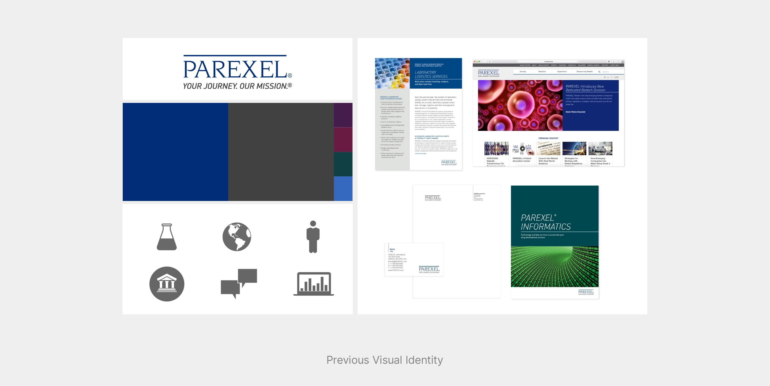
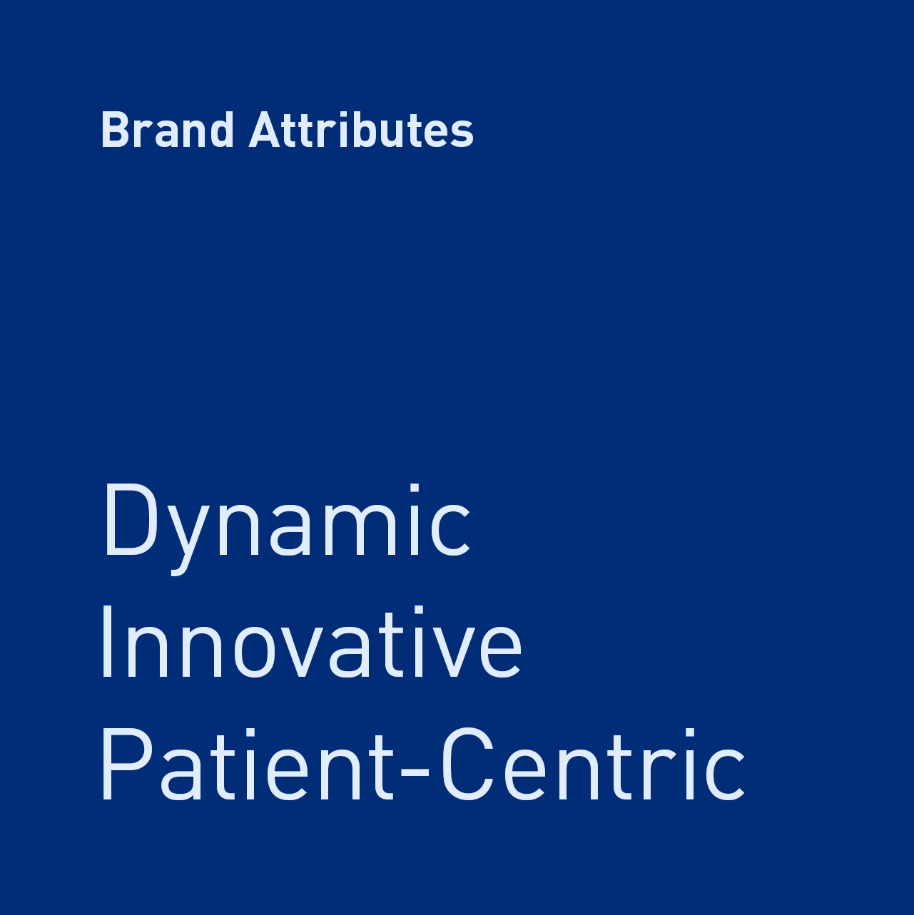
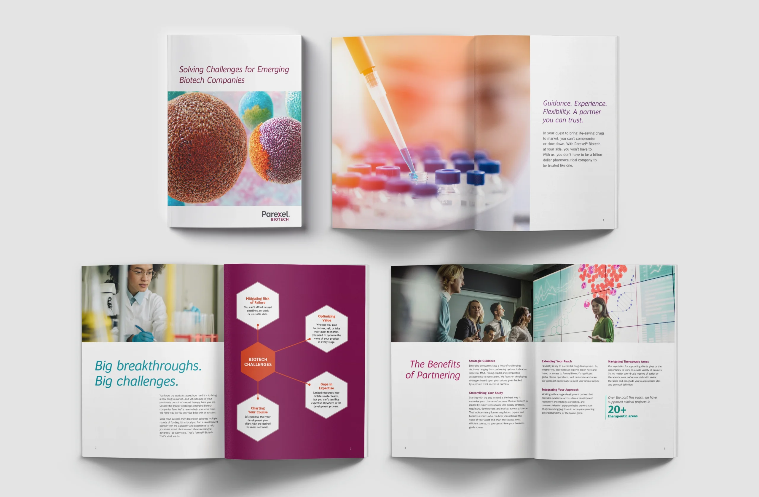
Parexel stood at the crossroads of tradition and innovation. The task was to evolve from a conservative brand identity to one that is bold and modern, capable of attracting a younger workforce, and reflecting its innovative spirit. The rebranding effort was designed to refresh the company’s overall image and to highlight its biotech division, emphasizing its role in driving forward growth and leadership in the clinical research sector.
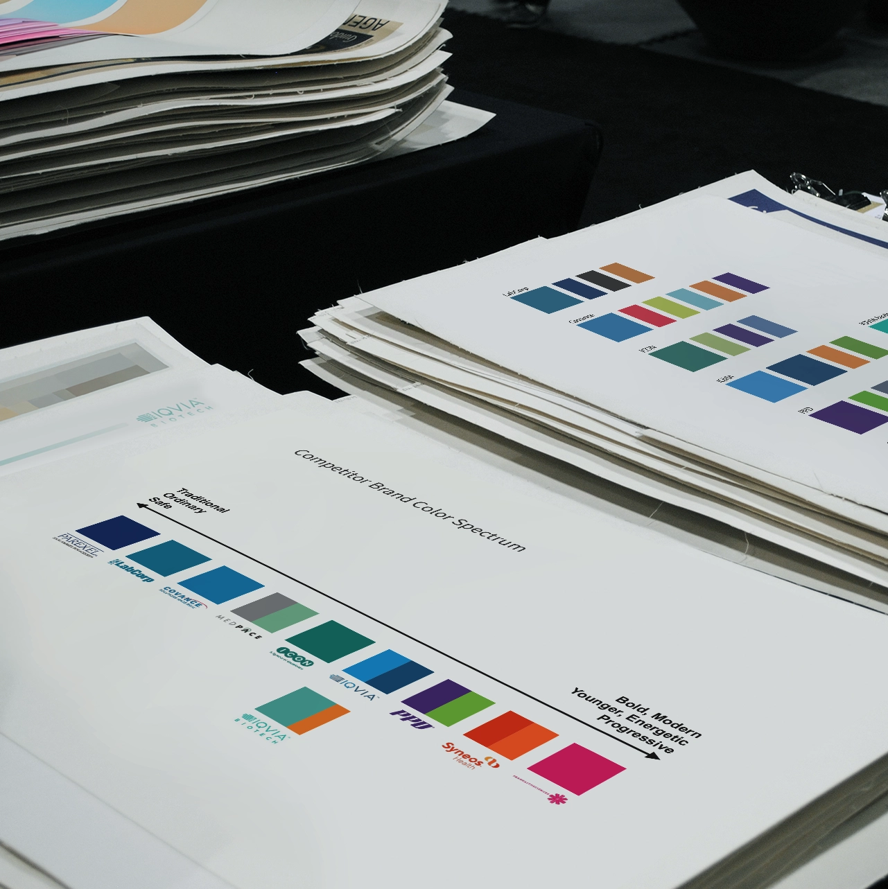
Navigating the competitive landscape of clinical research organizations required a nuanced approach. With the market ranging from traditional to boldly modern identities, determining Parexel’s unique position within this spectrum was essential. This strategic differentiation was vital for standing out among competitors and aligning Parexel’s visual identity with its renewed mission and innovative outlook.
The strategy
Integrating insights from our competitor landscape analysis, our strategy for rebranding Parexel was executed to ensure distinction in a market filled with both traditional and bold identities. This research was instrumental in identifying a unique position for Parexel, ensuring it stood out from the common visual themes among its peers.
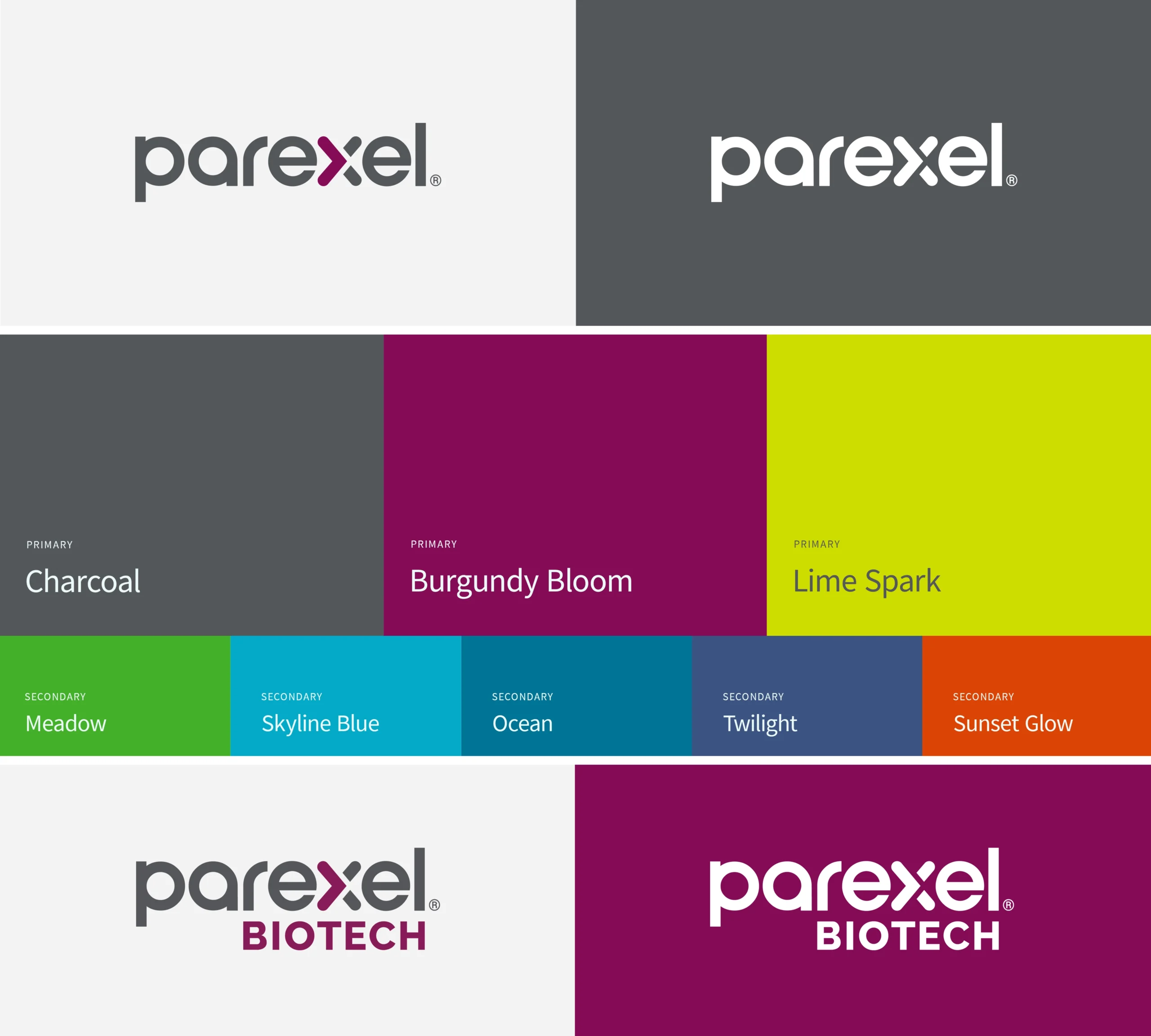
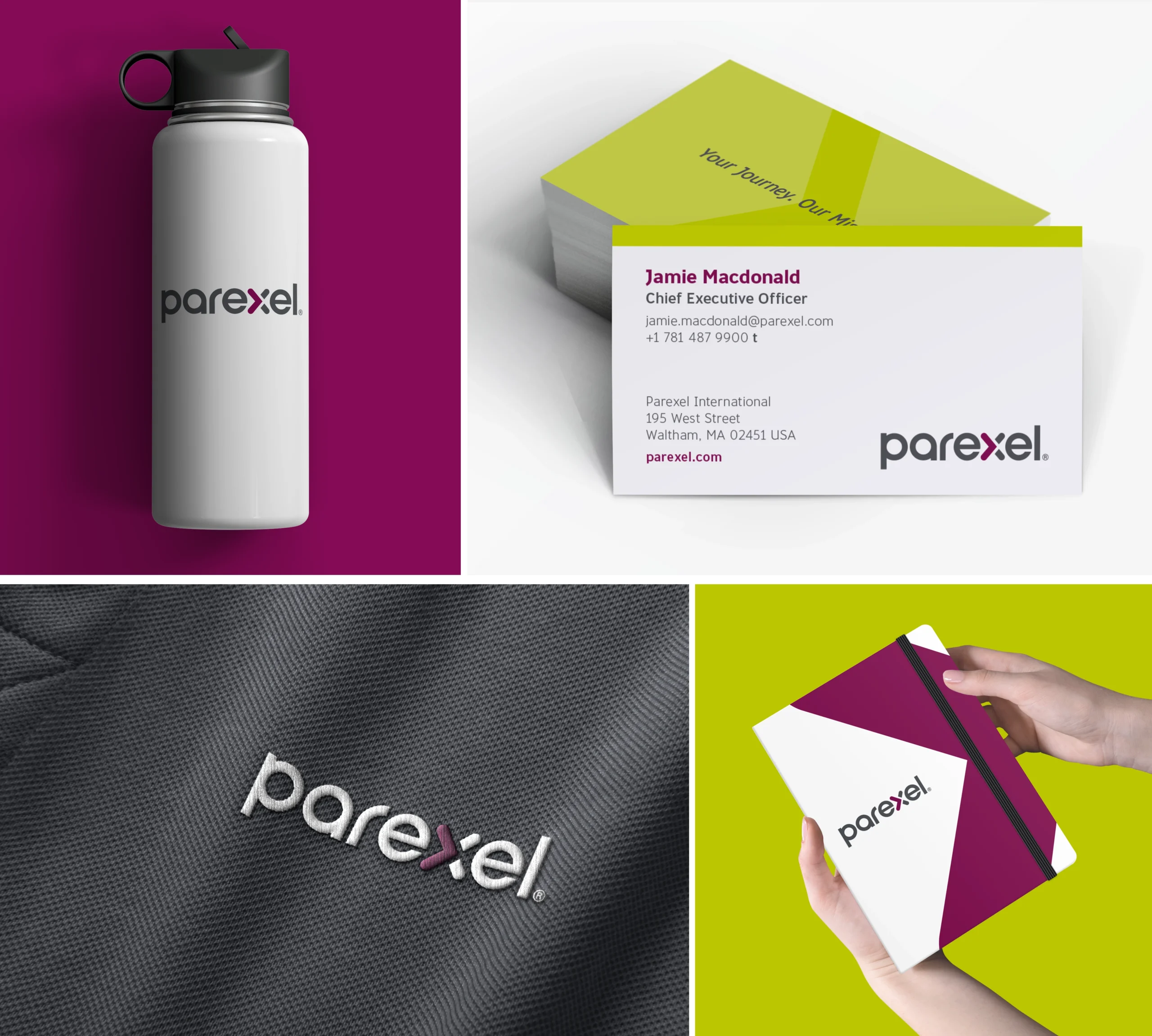
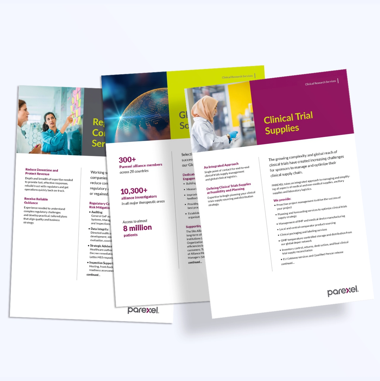
Our rebranding approach was holistic, transitioning from Parexel’s classical Roman-lettered branding to a contemporary, sans-serif typography that epitomized both boldness and approachability. The redesign of the logo, color palette, and typeface was deliberately tailored to appeal to a tech-savvy audience with fresh and modern hues. This strategic transformation aimed to blend Parexel’s rich heritage with a progressive outlook, creating a brand identity that signified the company’s dedication to innovation and leadership in the clinical research field.

The result
The rebranding of Parexel has successfully set a new course for the company, visually encapsulating its evolution and readiness to embrace the future. This transformation was not just about altering appearances; it was a strategic move to align Parexel’s external identity with the internal goals of new leadership, representing the first step in a larger plan to rejuvenate the brand.
The introduction of a new logo and visual identity marked a significant shift towards a more modern and approachable brand. This visual evolution reflects Parexel’s commitment to innovation, appealing to both a new generation of talent and the wider clinical research community. This rebranding effort served as the groundwork for the subsequent development of a comprehensive brand campaign, guided by the company’s leadership.
"Working with Orange Square on our rebrand brought to light the depth of understanding and insight that only comes from years of close collaboration. Their approach went beyond typical design work; it was a strategic partnership that leveraged their extensive knowledge of our mission and goals to truly redefine our brand identity. Orange Square skillfully managed tight deadlines and complex feedback. With our long history of working together, they were able to infuse our rebranding effort with creativity, strategy, and a deep sense of our business landscape. The result is a rebrand that captures the spirit and values of Parexel, setting a solid foundation for moving clinical research forward."
Sean Gallimore
Corporate Vice President, Chief Marketing Officer